Why Color Theory Is the Foundation of Every Great Artwork

Robin - November 14, 2025
Share

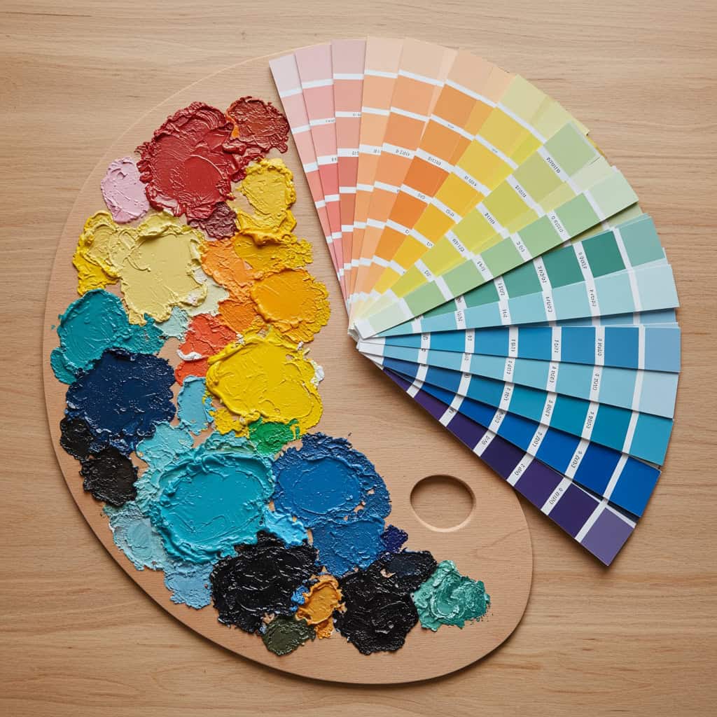
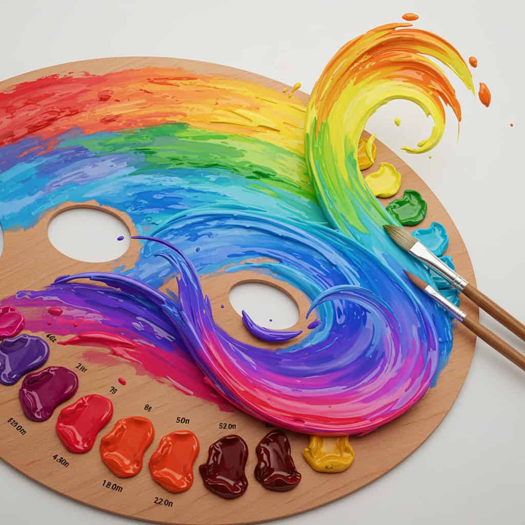
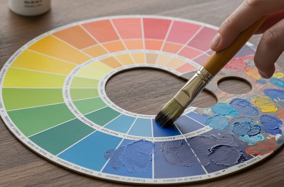
Color theory is the cornerstone of visual art, guiding artists in the effective use of color to evoke emotion, create depth, and achieve balance. By understanding relationships between hues, the principles of harmony, and the power of contrast, creators can elevate their work from ordinary to extraordinary. Mastering color theory enables artists to communicate visually, enhance storytelling, and ensure their pieces resonate with viewers.

The Basics of Color Theory

Step 1: Understand the Basics of Color Theory
Color wheel displaying primary, secondary, and tertiary hues—essential for understanding color relationships in art. | Generated by Google Gemini

Grasping the fundamentals of color theory begins with the color wheel, a visual tool that organizes hues in a logical sequence. The wheel is divided into primary colors (red, blue, yellow), secondary colors (green, orange, purple), and tertiary colors, which are blends of the two.

These elements form the building blocks for every color combination and interaction in art. By mastering these basics, artists lay a strong foundation for decision-making in their work. For a deeper dive into the color wheel and its uses, visit Color Matters: Basic Color Theory.

Learn About Color Harmony

Step 2: Learn About Color Harmony
A vibrant painting showcases perfect color harmony, blending complementary and analogous hues in sweeping, dynamic brushstrokes. | Generated by Google Gemini

Achieving color harmony involves selecting colors that work well together for a pleasing visual effect. Artists often use complementary schemes (colors opposite on the color wheel), analogous schemes (colors next to each other), or triadic schemes (three equally spaced colors) to create balance and unity.

To select harmonious combinations, start by identifying the primary color and then choose additional hues based on these schemes. The result is artwork that feels cohesive and visually engaging. Explore more about harmonious color schemes at Sessions College Color Calculator to experiment with your own palettes.

Explore Warm and Cool Colors

Step 3: Explore Warm and Cool Colors
A vibrant scene where warm reds and oranges blend seamlessly into cool blues and greens, illustrating striking color temperature contrasts. | Generated by Google Gemini

Understanding the difference between warm and cool colors is essential for creating atmosphere and depth in artwork. Warm colors, such as reds, oranges, and yellows, often evoke energy and warmth, making elements appear closer to the viewer.

Cool colors, like blues, greens, and purples, tend to recede, suggesting calmness and distance. By strategically using temperature, artists can guide the viewer’s eye and establish emotional tone within a composition. For more insights into leveraging color temperature in your art, visit Artists Network: Warm and Cool Colors.

Apply Color Contrast and Balance

Step 4: Apply Color Contrast and Balance
Vivid blocks of red and blue create striking color contrast on a neatly arranged table, drawing the viewer’s eye to the centerpiece. | Generated by Google Gemini

Effective use of contrast and balance transforms a composition, making it captivating and clear. Contrast can be achieved by pairing light and dark values, or by juxtaposing complementary colors to create focal points and highlight key elements.

Balancing colors involves distributing hues and intensities evenly throughout the artwork, preventing overwhelming or dull areas. Artists should experiment with high and low contrast to guide viewers’ attention and generate visual interest. For actionable tips and examples on mastering color contrast and balance, explore Creative Bloq: What is Colour Contrast?.

Use Color to Convey Emotion and Meaning

Step 5: Use Color to Convey Emotion and Meaning
A vibrant canvas bursts with an emotional color palette, each hue symbolizing a different facet of artistic expression. | Generated by Google Gemini

Colors possess the unique ability to evoke emotions and communicate meaning within artwork. For example, blue often symbolizes calm or sadness, while red can signify passion or urgency. By thoughtfully selecting a color palette, artists can reinforce the mood and message they wish to express.

Considering cultural associations and personal experiences with color can further deepen the emotional impact. To craft artwork that resonates with viewers, choose colors that align with your intent. For more on the psychological effects of color, visit Verywell Mind: Color Psychology.

Practice and Experiment with Color Theory

Step 6: Practice and Experiment with Color Theory
An artist carefully blends vibrant paints on a palette, exploring color theory through hands-on art experiments at their studio desk. | Generated by Google Gemini

The true mastery of color theory comes from consistent practice and experimentation. Start by creating small studies using different color schemes, such as monochromatic or complementary palettes. Challenge yourself to paint the same subject with varying color temperatures or contrasts to observe their effects.

Keeping a color journal or swatch book can also help refine your understanding over time. Embrace mistakes as learning opportunities and let curiosity guide your creative process. For hands-on project ideas and exercises, explore Skillshare: Color Theory Exercises to further develop your skills.

Conclusion

Conclusion
A vibrant collection of paintings bursts with color, reflecting an artist’s journey of growth and mastery in every brushstroke. | Generated by Google Gemini

Mastering color theory is essential for any artist seeking to create compelling, meaningful artwork. Understanding basic concepts, harmony, temperature, contrast, and emotion enables you to craft visuals that resonate with viewers. Continued learning and experimentation are key to refining these skills and unlocking new creative possibilities.

Whether you are just starting or looking to deepen your expertise, resources like Canva’s Color Wheel offer valuable tools for ongoing exploration. Embrace color theory as your foundation and watch your artistic expression flourish.

Advertisement